Lorem ipsum dolor sit amet, consectetur adipiscing elit. Pellentesque vitae nunc ut dolor sagittis euismod.
Working hours
Monday - Friday: 10:00 - 19:00 Hours
Saturday: 10:00 - 16:00 Hours
Sunday: Closed
Social Links
Wells Fargo Case Study
About
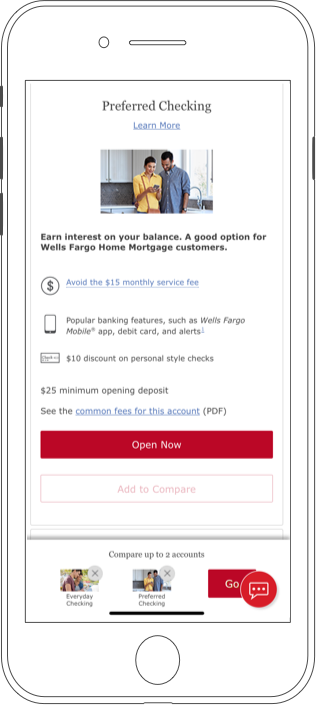
Wells Fargo - Compare Checking
The project’s producer and I, redefined the project.
Initial ask: Remove an account from the compare experience. Ambiguities with compare content were discovered. I took initiative to propose fixing this experience.
Problem that I had was that this was not in scope for the budget. So a complete redesign was out of the question. I worked to find a solution that was in scope and budget. This meant working with the available schema and not asking for any new interactions that needed a new module or hard coding.
I focused on the content and the flow of the experience as well as keeping my eye on the goal of the user.
How to easily cross reference the checking accounts and key features available.
Problem
90%
Tasks
95%
Actions
97%
Results
99%
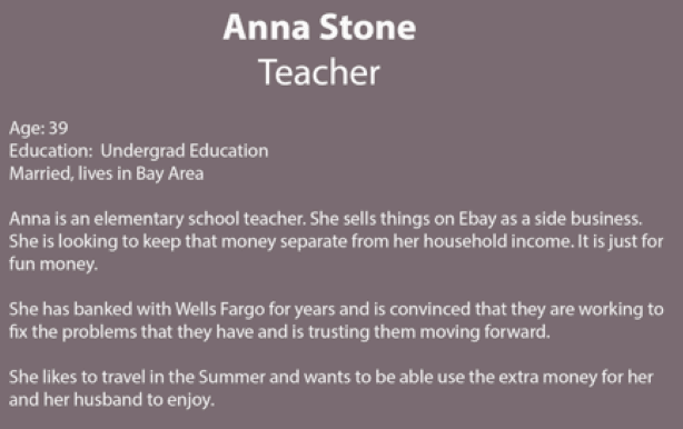
“When I started my side business, I wanted an easy way to separate my accounts. I wanted another personal account that would be just my fun money and not co-mingled with my personal account.”
~Interviewed Wells
Customer
Design Process
Problem – Situation The Checking Comparison key features and line items did not line up visually or content wise, across products in a side by side comparison. The budget was small but able to handle adding text schema changes. I needed to outline the incremental changes within the budget and get approvals within the deadline.
Tasks – My Goals • Competitve analysis of several financial product’s ‘Checking Compare’ xperiences • Identify the bullets that were not aligning across our products • Create a presentation to pitch the proposal
Action
Create
• Presentation to Stake Holders, LOB and Legal for buy in • Create Wireframes • Schema maps • Create content and documentation: Visuals, copy, icons, mockups and prototypes • Documentation included: copy deck, interaction specs, redlines and schema map • Tested with iRise prototype in listening lab, created interaction specs for devs
Result
Results and Outcome
We gained approval for content changes. (The original ask was to remove one product from compare). We added Apply Now CTA’s to reduce friction for the applicant to navigate to the application. I added a smaller sticky header in order to present the product name throughout the scroll and maintain real estate for the compare content We re-wrote the copy and assessed icons for alignment across products. Results: Line of business was very pleased with changes and the simplified compare experience delivered within timeline and budget. Successfully addressed applicant’s pain points.
Role
Product Designer
UX/Interaction Design, Visual Design
Personas
Personas
Key Tasks
• Fulltime work • Side job driving for Uber • Maintain separate control of both accounts
Goals
• Simply set up side checking account without going into the branch • Choose account with no or few fees • Compare features before applying for an account
Pain Points
• Set aside money without fees • Move money from one account to another easily • Manage account from mobile application
“ I look at the fees first. I want to
go to the compare accounts first.
Scrolling through all the accounts
first is too much work.”
~Interviewed Wells
Journeys, Flows and Wires
“ I want a “set aside”
checking account. I want
to have an account that is not
apart of my personal account
or savings.”
Business Value
Wells Fargo Bank The business strategy is to bring a compare checking experience that is fluid and easy to navigate. It is important that the content is relevant to what the applicants want to know and to compare. Further, keeping abreast of competitive design and interactions as well as content is important in order to serve our customers a better solution, they are comparing across banks as well as our products.
The Business Value is getting the applicant an easy way to get answers and quickly go to online Open Now in keeping with the business goal of having the applicant get an account open online without having to visit a branch.