Charles Schwab System Design
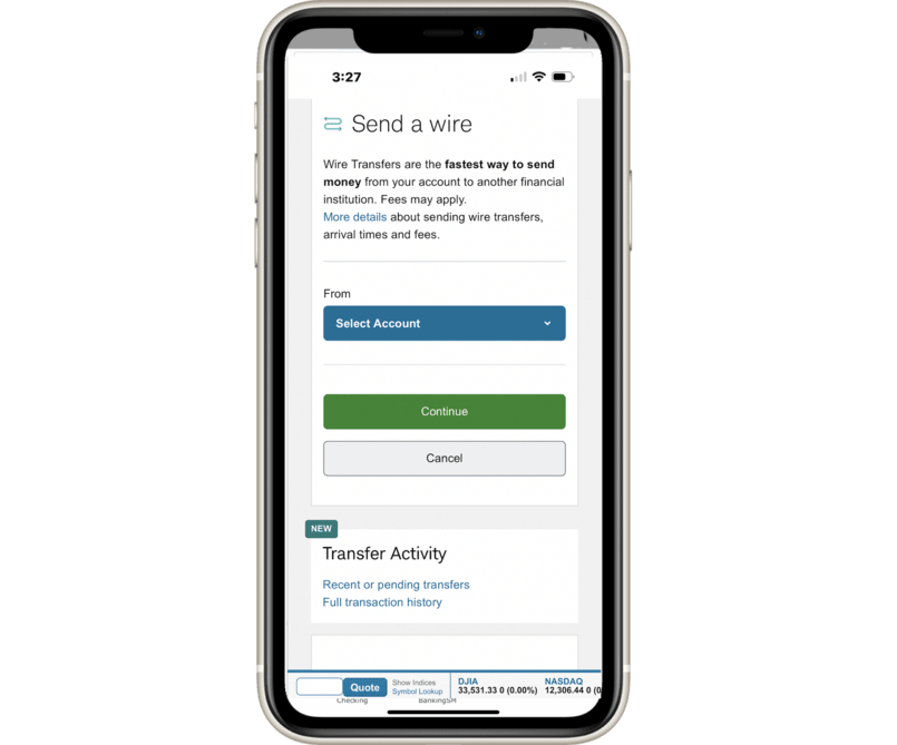

Display Value Component Revision
Charles Schwab Design System
Display Value
~Product Manager
As part of the Charles Schwab Design System, I led the redesign and standardization of the Display Value component to support consistent, accessible, and flexible data presentation across web and mobile products.
Originally created for summary and detail pages, the Display Value component had evolved inconsistently across business units.
My role was to audit existing usage, identify gaps, and design a scalable system-level solution that could support multiple layouts, data densities, and accessibility requirements without introducing unnecessary variants.


Personas
Key Tasks
Designers operate in a large-scale ecosystem where components must work across products, platforms, and data densities while meeting accessibility and brand standards.
Goals
- Use a single Display Value component across multiple layouts and platforms.
- Confidently handle long labels, supporting values, and responsive behavior.
- Design within accessibility constraints without creating new variants.
Pain Points
- Inconsistent baseline alignment when values are displayed vertically.
- Long labels caused unpredictable wrapping and spacing.
- No system-supported option for horizontal vs. stacked supporting values.

Design Process
Problem - Situation
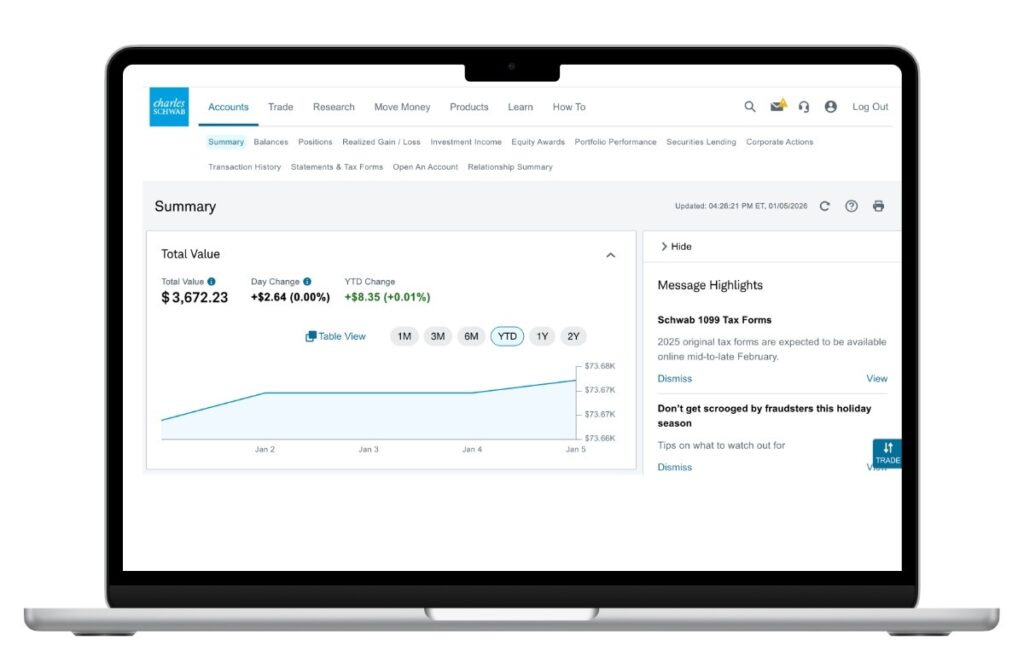
- Primary values appeared misaligned when displayed horizontally across a page, creating baseline inconsistencies.
- Long titles caused unpredictable wrapping, resulting in excessive spacing or misaligned text.
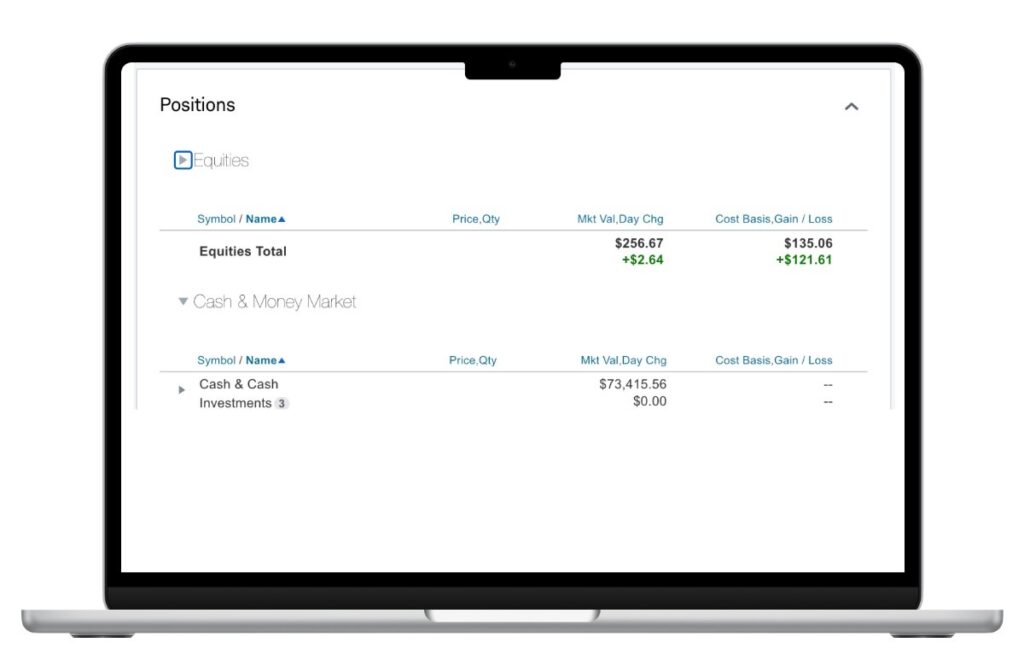
- Supporting values were displayed inconsistently—sometimes stacked, sometimes horizontal—with no dedicated component to support both patterns.
- Individual business units modified the component independently due to unclear documentation, resulting in excessive variants and visual drift.
- These inconsistencies increased design debt, slowed product teams, and created accessibility risks.
Tasks - My Goals
- Audit existing Display Value usage across Schwab products (web and mobile).
- Partner with product owners and developers to define a solution feasible across multiple business units.
- Present findings and recommendations to the Design System and ADA Compliance teams.
- Design a flexible, scalable component for the Figma design library.
- Collaborate with developers to ensure parity between design and development libraries.
- Create clear, reusable system documentation to prevent future fragmentation.
Actions
- Designing a single flexible component that supports both horizontal and stacked supporting values.
- Matching supporting value typography to the primary value baseline in horizontal layouts to maintain visual alignment.
- Allowing titles to wrap naturally without disrupting vertical rhythm or alignment.
- Enabling designers to toggle supporting values on or off without breaking layout integrity.
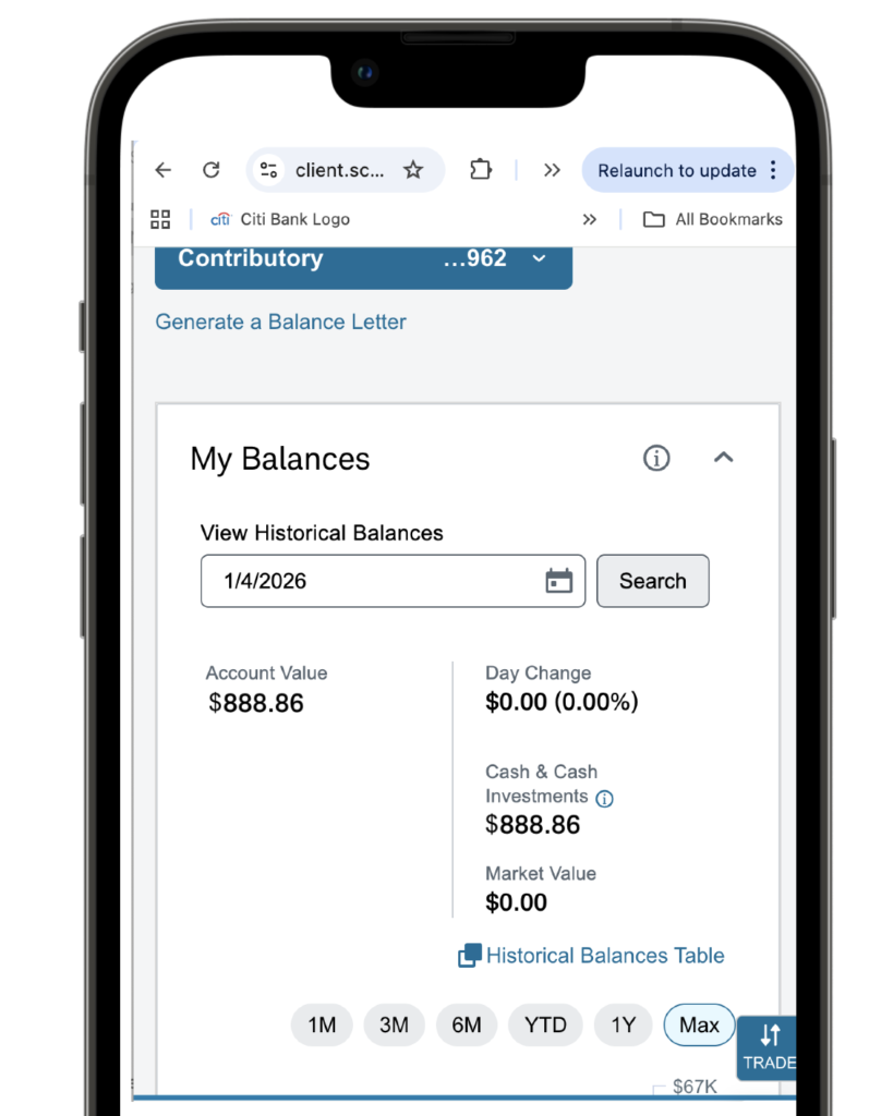
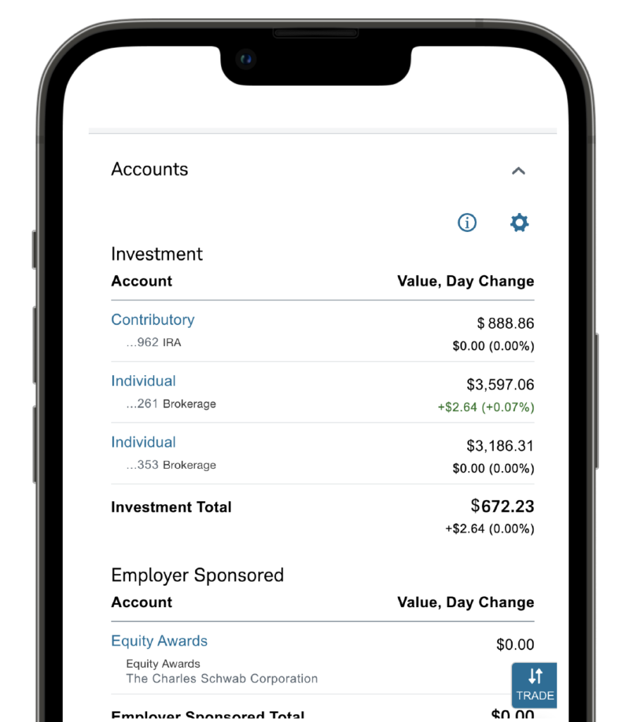
- Supporting responsive behavior for both mobile and web contexts.
- Ensuring all configurations met ADA accessibility standards.
Results and Outcome
- Ensured designers could confidently apply the component across products without redesigning it for each scenario.
- Delivered a unified Display Value component that supports multiple use cases without introducing unnecessary variants.
- Reduced ambiguity and ad-hoc modifications across business units.
- Improved alignment, readability, and accessibility across products.
- Established clear documentation that designers and developers could rely on as a single source of truth.
Journeys, Flows and Wires
- Title wrapping behavior
- Horizontal and stacked supporting value configurations
- Mobile and web responsive layouts Optional supporting value states – Horizontal, Stacked, Show/Hide
- This ensured designers could confidently apply the component across products without redesigning it for each scenario.
Summary Page - Horizontal Variant
Position Page - Vertical Supporting Value Variant
Responsive Solution - Balances and Accounts

Business Value
- Move faster with fewer design decisions and approvals.
- Maintain visual and functional consistency across products and platforms.
- Reduce design and development rework.
- Improve long-term scalability and governance of the design system.

Next Steps
Redlines to developers
Documentation

